Unless you have a background in marketing or visual arts, understanding how to choose a color palette for your skin care business can be intimidating (or just a plain afterthought).
In response to the following poll:
“How did you choose the color palette for your business branding?”
A) Inspiration from another company
B) Color psychology
C) A color palette website
D) I just like them
The overwhelming majority said ‘D’…because they like them.
Yikes.
If this sounds familiar, you’re in the right spot – understanding the importance of color is a MUST for any successful business owner.
(ESPECIALLY if you’re selling online.)
In this article, we’ll cover:
- Color theory 101
- Color psychology
- Inspiration from skin care brands who nailed it
- 9 steps to choosing a color palette for your OWN skin care business

This post may contain affiliate links, meaning I get a commission if you decide to make a purchase through my links (at no cost to you). Please read the disclosure for more information.
The Power of an Intentional Color Palette
Stop to consider these amazing consumer behavior statistics:
• 90% of an initial impression is influenced by color.
• Colors are perceived differently based on gender and culture.
• 93% of shoppers focus on visual appearance alone when they consider a purchase.
Source: https://review42.com/resources/color-psychology-facts
These numbers speak volumes.
The success of your business depends on your decision to choose your color palette INTENTIONALLY and finely tune the message that you want to send.
To do this, you have to have a crystal clear picture of your business mission, values, and target market before you’ll be able to choose an effective color palette.
If you’re just now starting your skin care business (or diving into a rebrand), I highly encourage you to dig deep into those areas before reading on.
Have your mission and target audience in mind (and even printed out or up on the screen) as you read through this post to come out with some really solid ideas.
Color Theory
So that we’re all on a level playing field, let’s cover a little basic color theory before moving on: color terminology, color categories, and color schemes.
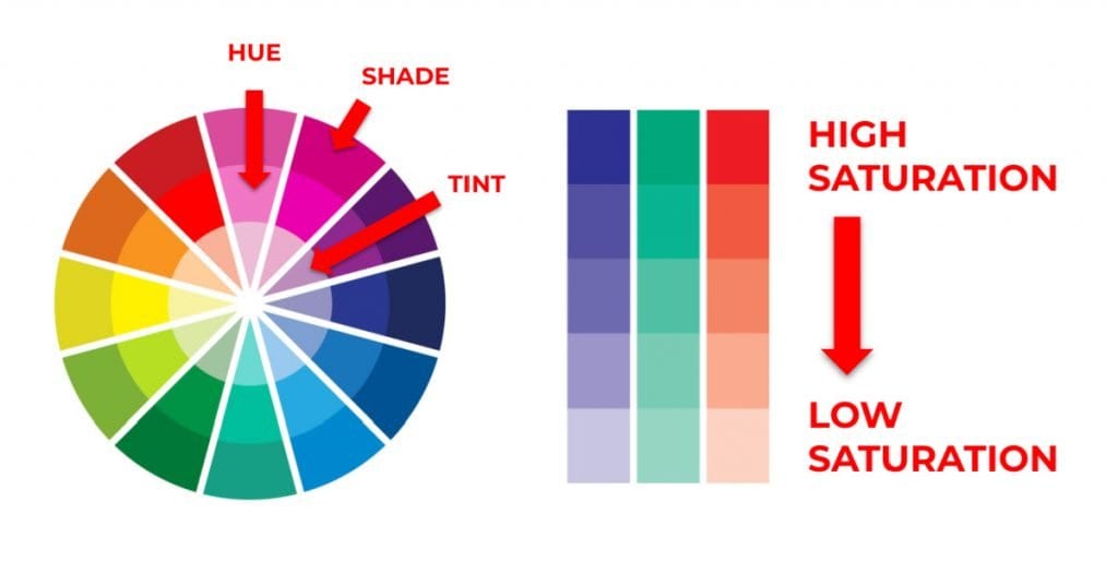
Color Terminology
Hue: A pure color on the color wheel (red, orange, yellow, green, blue, purple…and combinations of these) without any tint or shade added.
Saturation: The richness of a color. As saturation increases, the colors appear to be more pure. As the saturation decreases, the colors appear to be washed out.
Tint: Hue + White
Shade: Hue + Black
Tone: Hue + Gray
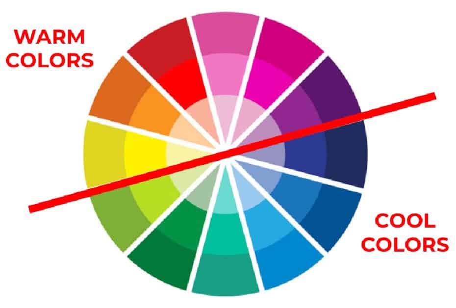
Color Categories
Warm colors:
Red, yellow, orange, and variations of these colors (such as burgundy and pink).
These colors evoke warmth due to their brightness and link to the sun. In general, they convey optimism, enthusiasm, and passion.
Cool colors:
Green, blue, purple, and variations (such as lilac and turquoise).
These colors are considered cool as they are colors commonly found in nature and are known for their calming effect. These colors are peaceful, relaxing, and subdued.
Neutral colors:
Brown, black, white, and variations (such as tan and gray).
Sometimes referred to as the ‘earth tones’; can be powerful and pure.
Color Schemes
A color scheme is a choice of colors used in art and design contexts.
Using the same color scheme in all of your branding and marketing decisions is what will make your business recognizable over time.
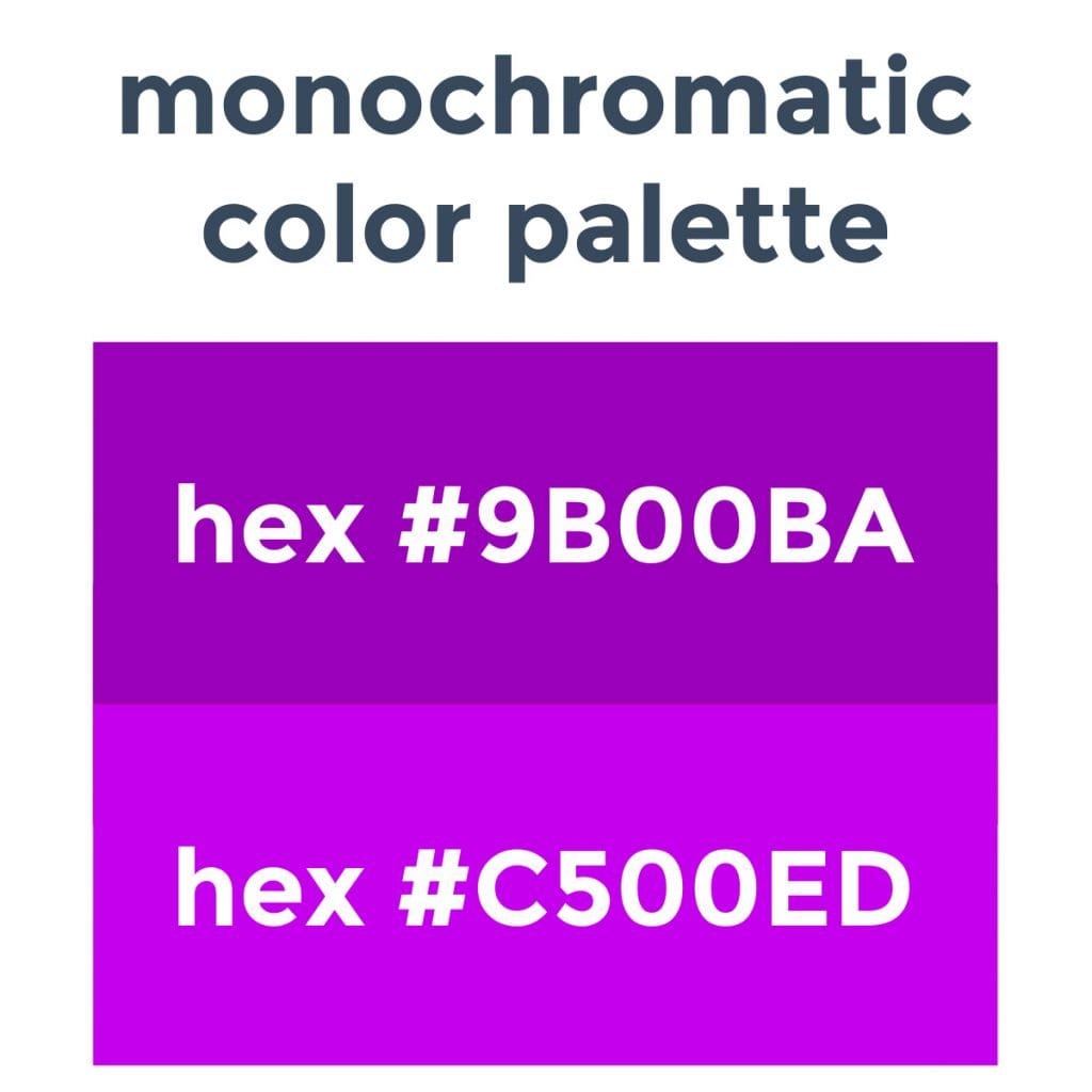
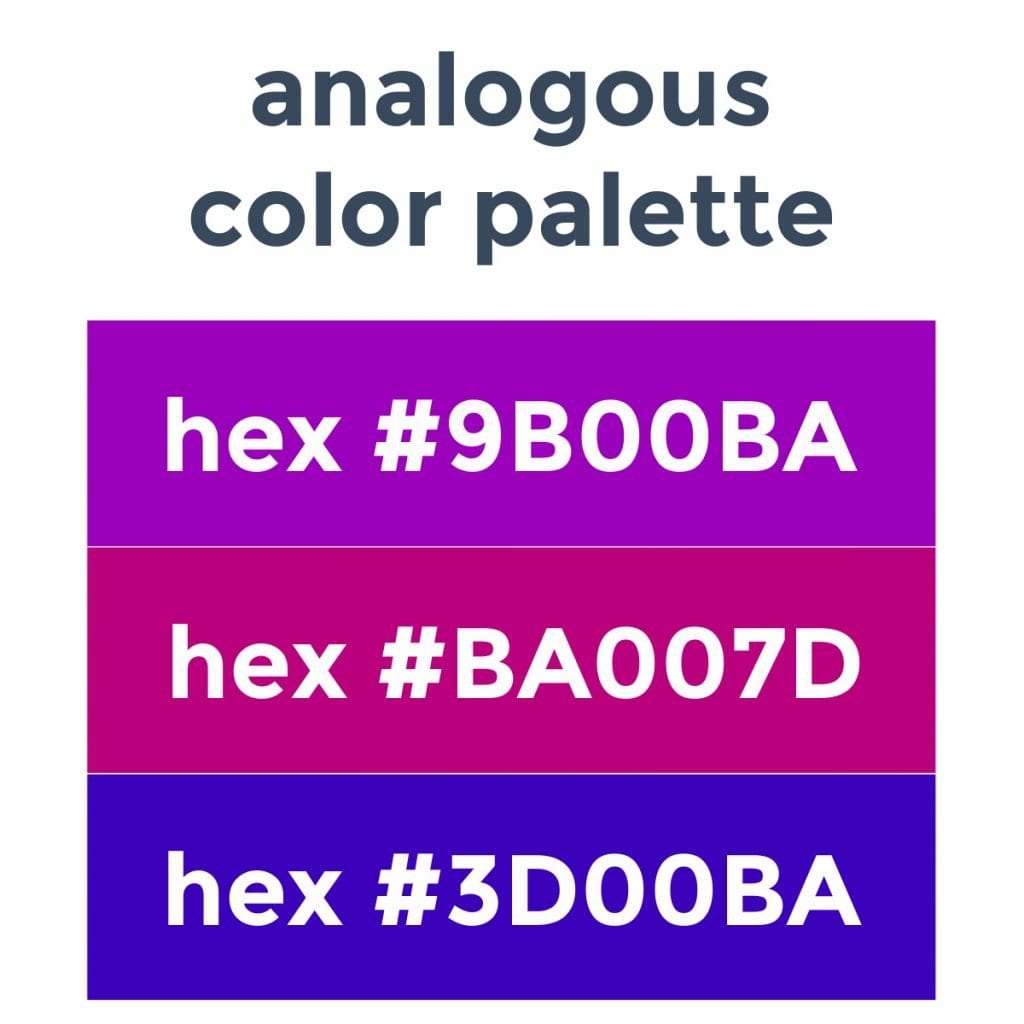
In the color scheme examples below, I use the same shade of purple as the base, yet a different impression is given based on the color scheme used.
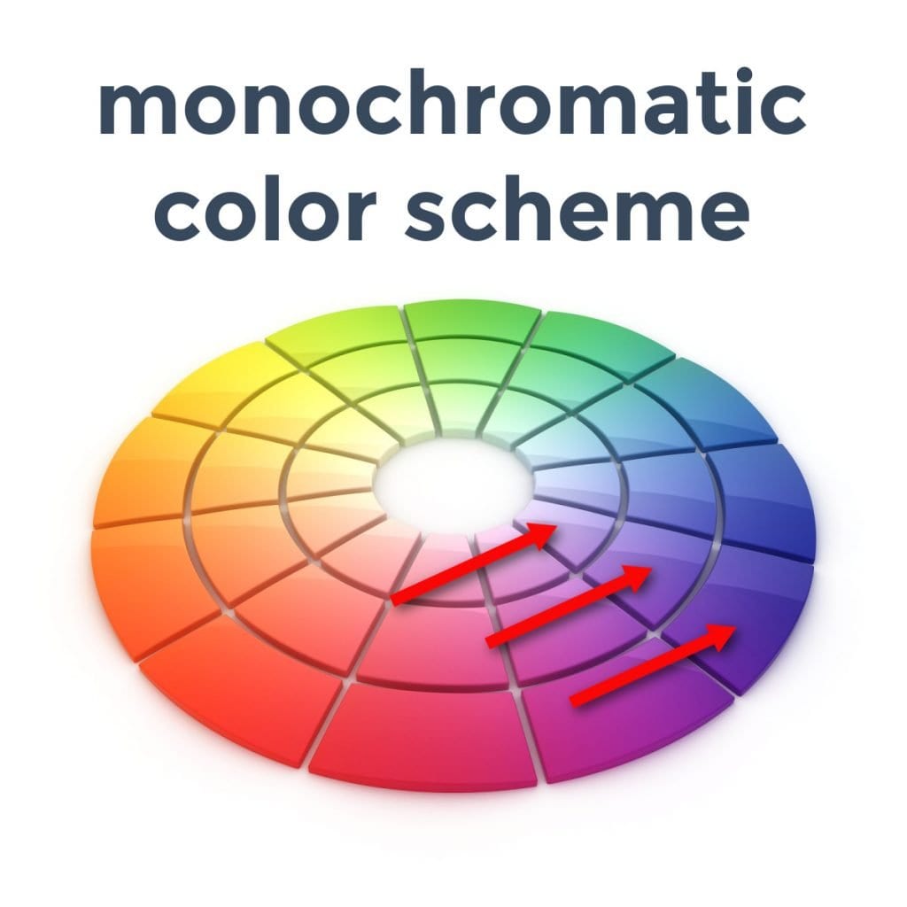
Monochromatic Scheme:
Different shades or tints of a single hue.
These are the simplest color schemes to make (but they can be boring if the shades are too close together).
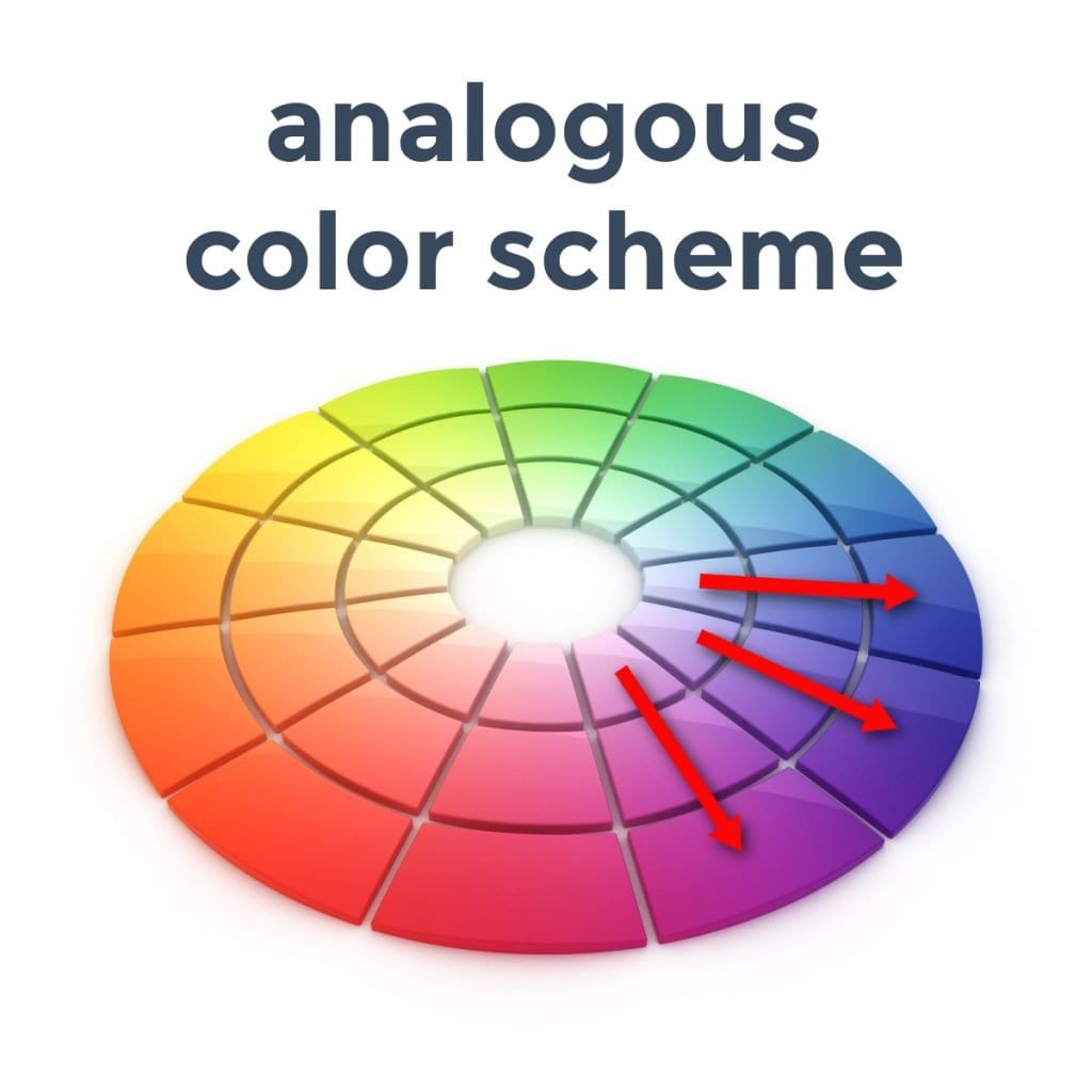
Analogous Scheme:
A main hue and colors on either side of it on the color wheel.
This is another easy color scheme to create that expresses consistency and uniformity.
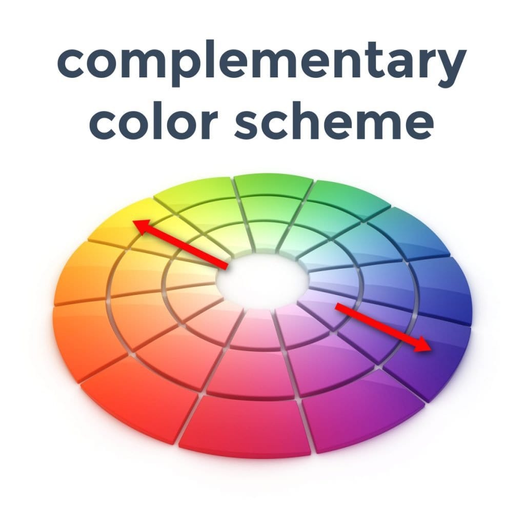
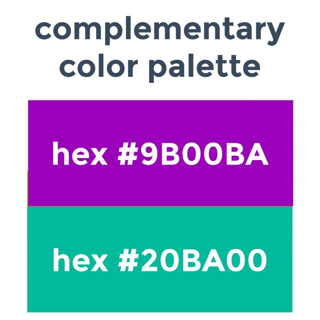
Complementary Scheme:
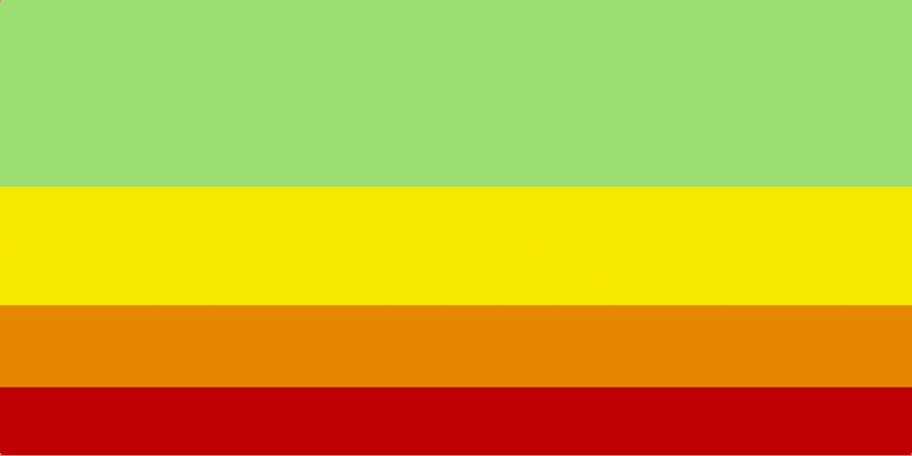
Complementary colors sit across from each other on the color wheel (red and green, orange and blue, purple and yellow*).
This scheme communicates a sense of balance (adding tints and shades creates even more depth).
*The visual of a complementary color palette below shows purple and green rather than purple and yellow…this example was taken from the Canva Color Wheel, which uses an RGB color wheel, which is slightly different than the ‘regular’ RYB color wheel most people are used to.
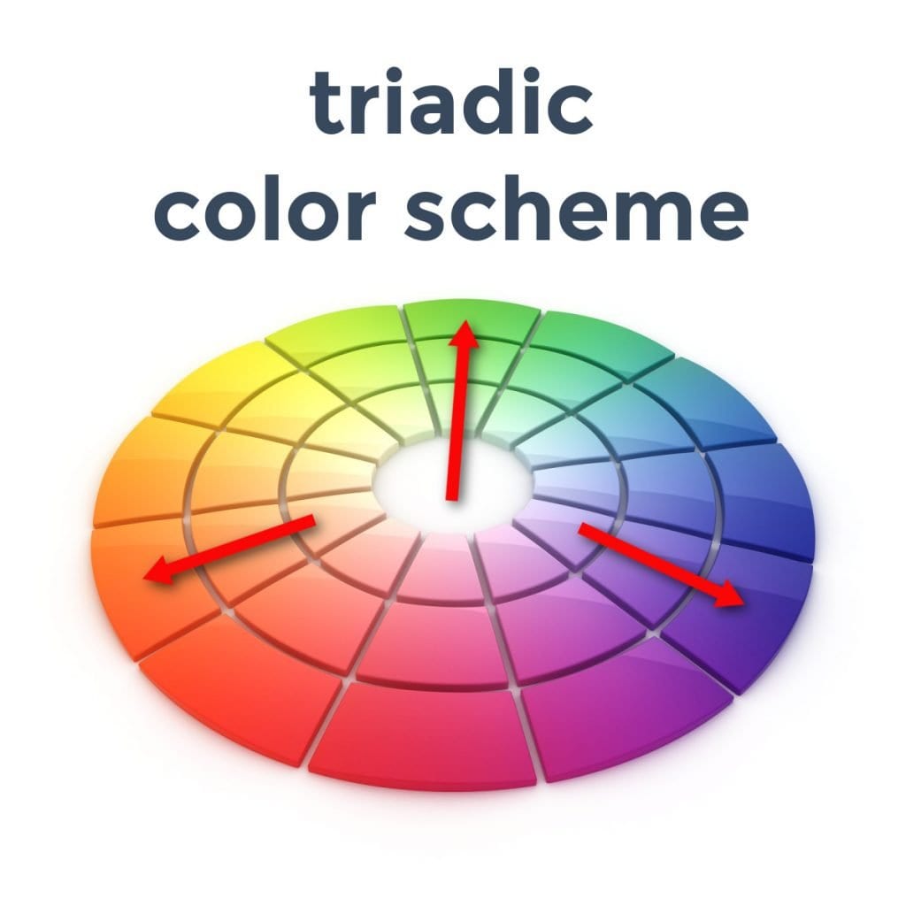
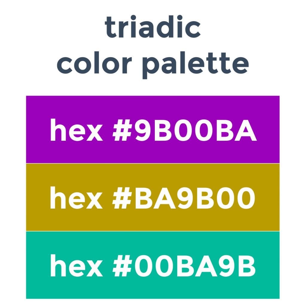
Triadic Scheme:
Three colors that are equal points from each other on the color wheel.
This palette creates more diversity, though it does take planning and experimentation so that it looks intentional.
Color Psychology
Color psychology is the study of hues and how they determine human behavior – this section is hugely important in deciding the color palette for your skin care business.
Color influences all sorts of perceptions, can cause certain emotions in individuals, and is even used therapeutically.
In marketing, color can make people trust a brand, create an impulse to buy, or believe that one brand has more authority than another.
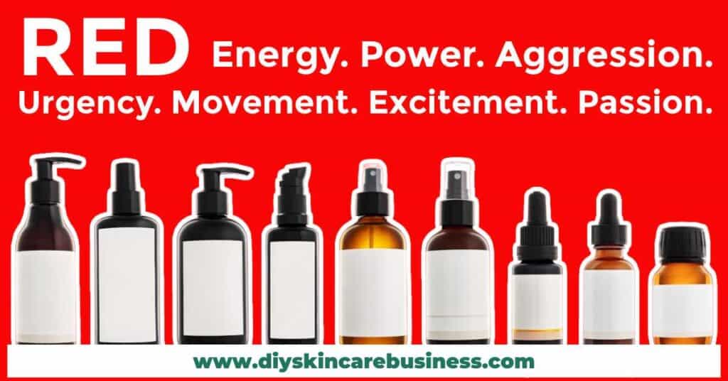
Red Color Palette Psychology:
Creates a sense of urgency, raises blood pressure and heart rate.
Movement. Excitement. Passion. Energy. Power. Aggression. Urgency.
(Also stimulates hunger. Incredibly popular for fast-service restaurants.)
Skin care brands that use red in their color palette:
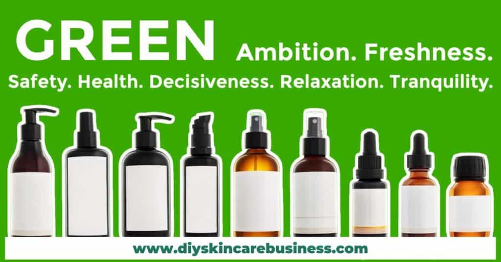
Green Color Palette Psychology:
The color of nature.
Ambition. Freshness. Safety. Health. Decisiveness. Relaxation. Tranquility.
Skin care brands that use green in their color palette:
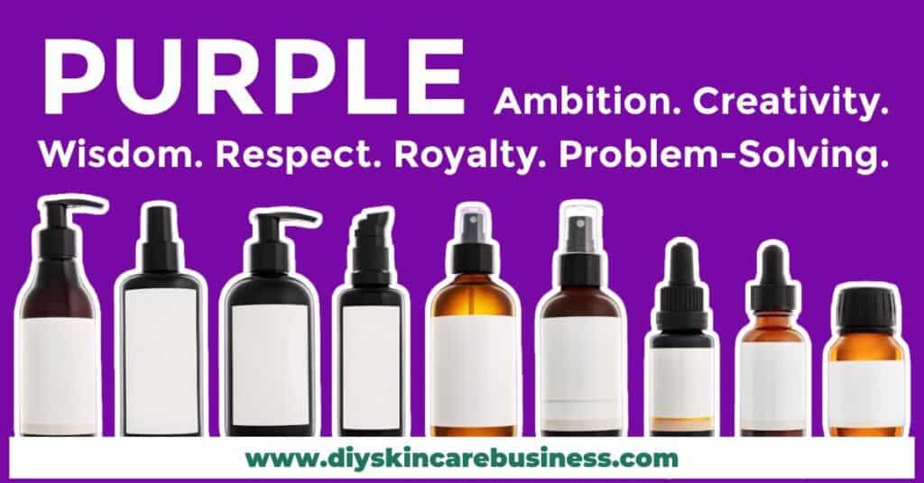
Purple Color Palette Psychology:
Provides a sense of luxury and uniqueness.
Ambition. Creativity. Wisdom. Respect. Royalty. Problem-solving.
(Widely used in the cosmetics industry.)
Skin care brands that use purple in their color palette:
Blue Color Palette Psychology:
Communicates peace, tranquility, and reliability.
Trust. Stability. Productivity. Confidence.
(A widely-used dominant color for financial institutions.)
Skin care brands that use blue in their color palette:

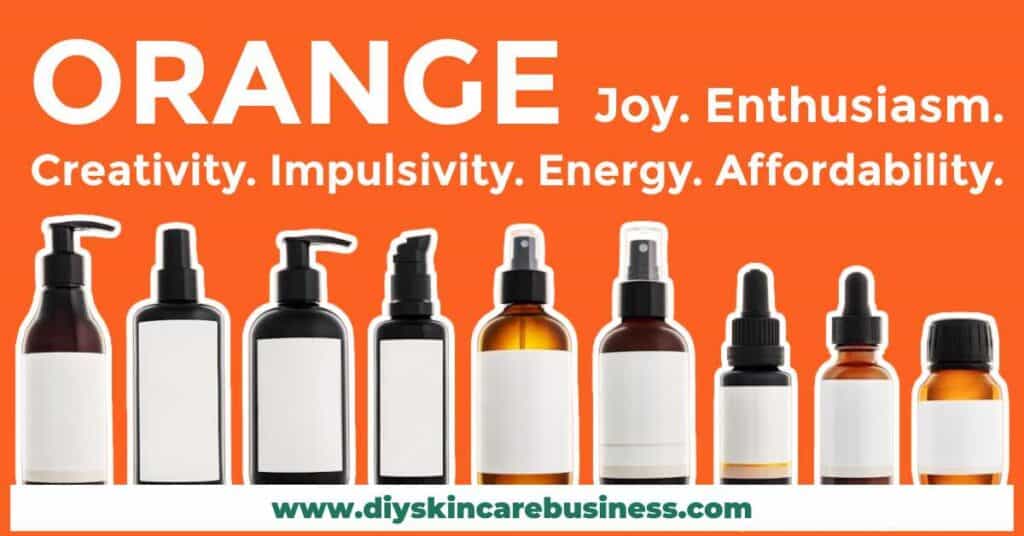
Orange Color Palette Psychology:
Orange subconsciously reads as ‘affordable’.
Joy. Enthusiasm. Creativity. Impulsivity. Energy. Power.
Skin care brands that use orange in their color palette:
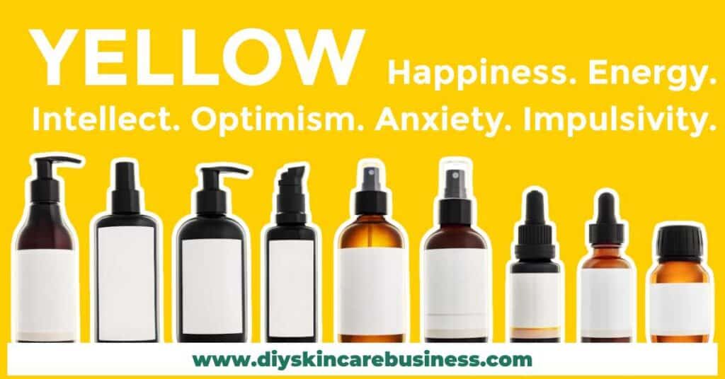
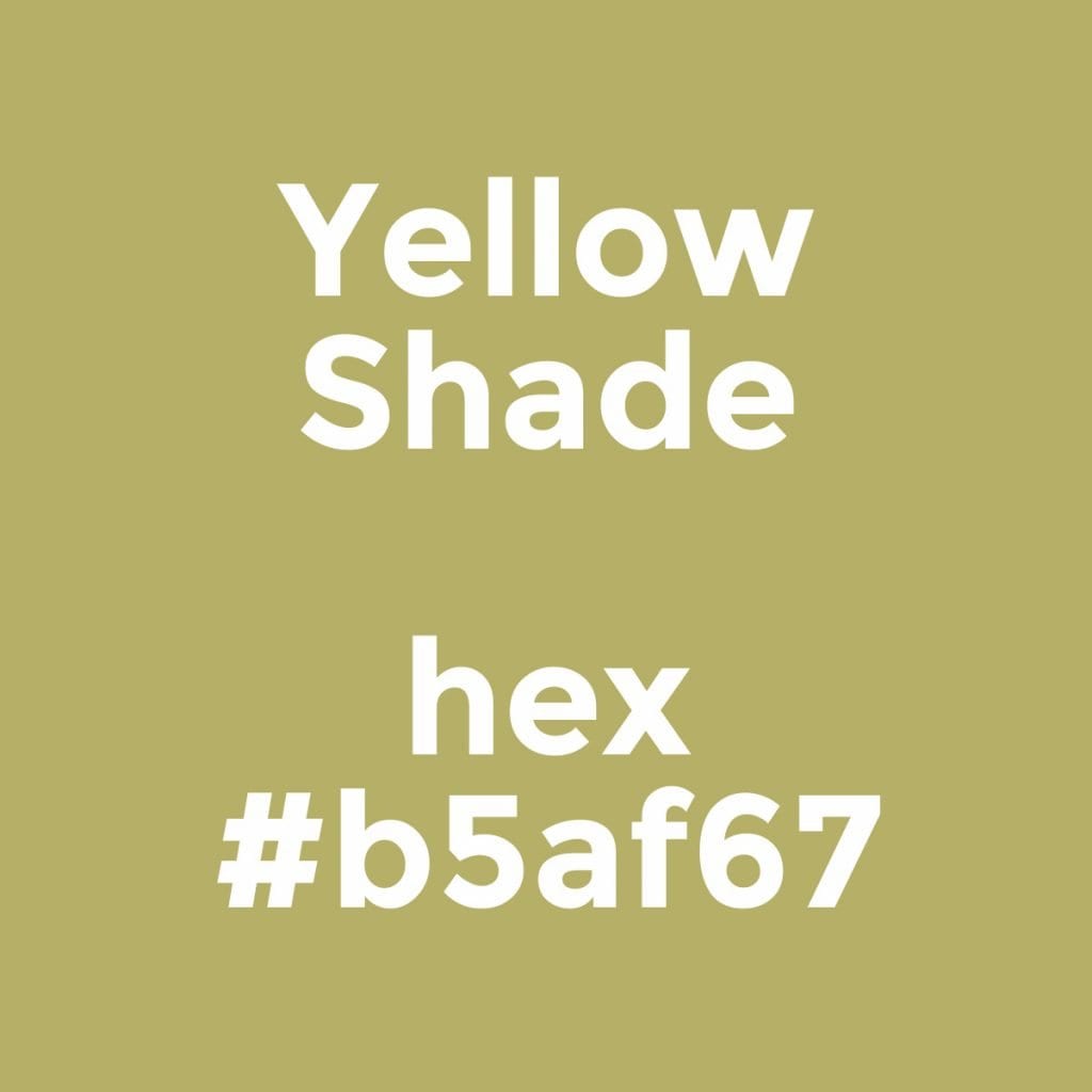
Yellow Color Palette Psychology:
Creates a cheerful and youthful feeling. Also symbolizes warning.
Happiness. Intellect. Energy. Optimism. Anxiety. Impulsivity.
(The most eye-catching color, which is why it’s used on caution signage…and post-it notes!)
Skin care brands that use yellow in their color palette:
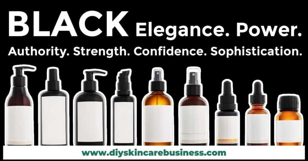
Black Color Palette Psychology:
Black is often seen as luxury and associated with higher prices.
Power. Elegance. Authority. Strength. Confidence. Sophistication.
(Some cultures see black as evil, darkness, and death. Do your market research.)
Skin care brands that use black in their color palette:
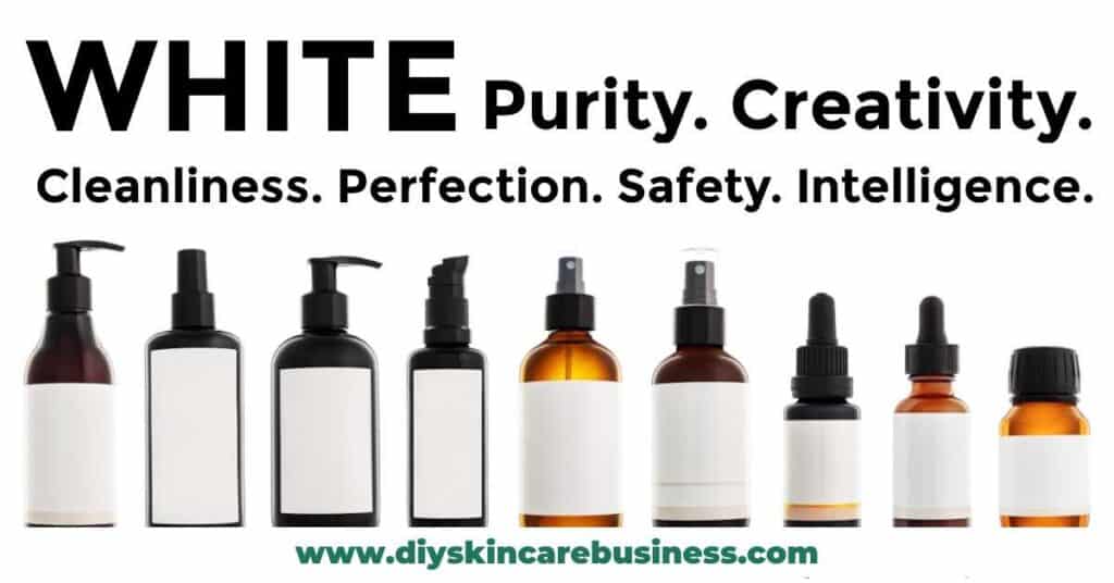
White Color Palette Psychology:
Projects a feeling of purity and creativity.
Cleanliness. Perfection. Safety. Professionalism. Intelligence. Simplicity.
(Can be challenging to incorporate into online marketing.)
Skin care brands that use white in their color palette:
Color Palette Challenges for Skin Care Businesses
Color Palette and Your Business Budget
As skin care makers, we do a lot of printing.
Product labels, business cards, logo stickers, invoices, etc.
When choosing your color palette, keep in mind that the more colors you have, the more expensive the print job will be (especially if printing at home).
Physical Products vs. Online Presence
Many skin care makers (especially organic formulators) automatically think of calming, nature-inspired colors (like greens and blues) for their branding.
This makes sense based on the color psychology described above.
While this would provide a peaceful, fresh, and tranquil feeling for a brick-and-mortar that someone is physically in, those same colors won’t necessarily attract attention online (depending on the tints and shades used).
If you plan on doing any digital marketing (Pinterest pins, Facebook ads, or even a basic Instagram post), you will need to use some hues that grab attention as individuals are scrolling through their social media feeds.
Just browse Pinterest for a few minutes and pay attention to which pins stand out from the others due to their use of vibrant color.
If you are leaning towards a more neutral or subdued color palette for your skin care business, consider throwing in a few bold accent colors for attention-grabbing details for marketing purposes.
How to Choose the Perfect Color Palette for YOUR Skin Care Business
Step 1: What are your Business Goals and Values?
Before making any ‘official’ branding decisions (such as color, font, and packaging choices), you need to define how you want to be perceived.
Ask yourself the following questions:
1. How do I want to come across overall?
2. What is the general feeling and impression that I want my audience to get from seeing my skin care line?
3. What is the unspoken promise to my customers?
If you need help answering these questions or want examples, head over to How to Write a Mission Statement for Your Handmade Skincare Business
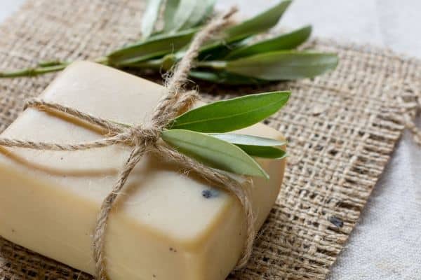
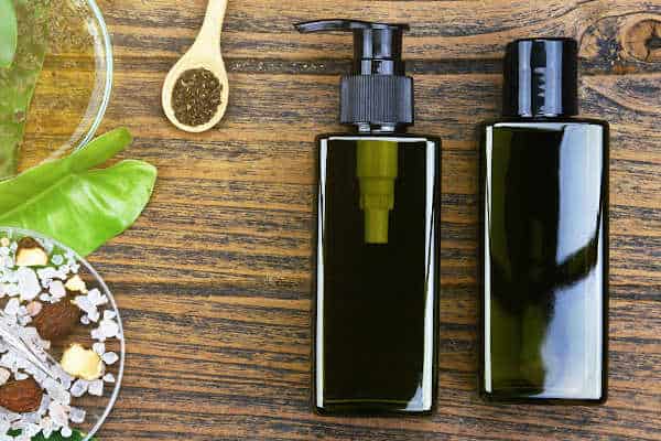
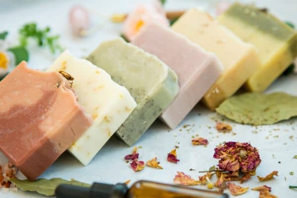
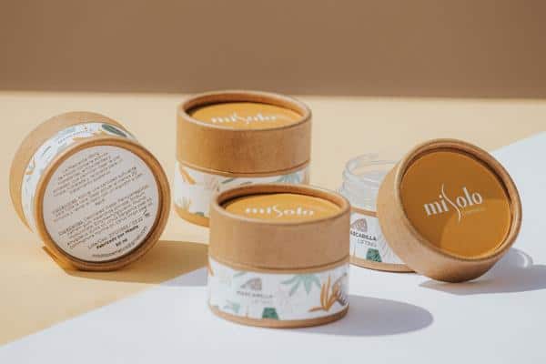
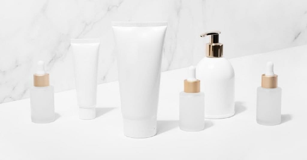
Reference the photos below for inspiration. Which one are you more drawn to? Why? What are these photos communicating about their product line?
Step 2: Know Your Target Market
After you have a solid business mission and impression in mind, be sure to nail down an incredibly specific target market (create a customer avatar).
You’ll want to know demographics, psychographics, interests, voice, fashion choices, etc.
What gender are you selling to?
- Women prefer blue, purple, and green
- Men prefer blue, green, and black
What age range?
- Younger = vibrant hues
- Older = subdued tones and shades
Every detail of your customer profile will give you a hint as to what colors will work the best for your personal branding.


Step 3: Explore Color Meanings and Psychology
What emotions or responses are you trying to evoke with your branding choices?
Consider the personality of your customer avatar and why they are looking for skin care products right now.
Look at the color psychology section and find words that you would use to describe your customer avatar or how they WANT to feel.


Step 4: Get Inspired
Create a list or folder of inspirational ideas. HAVE FUN!
Resource 1: Look at well-known brands.
There are several links to well-known skin care websites in the color psychology section above.
Take the time to click around and see what color palettes and schemes would fit with your avatar (and ask yourself what the company has done with its use of color to give you that impression).
Resource 2: Check out some color palette generator websites for ideas:
After you have a large number of links and ideas saved, look at all of them together.
Are there any similarities?
Is there a certain color or theme that pops up over and over again?


Step 5: Choose Your Dominant Color
Decide your dominant business color based on your business goals, target market, color psychology, and the themes you found as you gathered inspiration.
If you still can’t choose, a handy color quiz like this one can take the pressure off and decide on a general color for your business: Branding Color Quiz
BUT, keep in mind that there are many variations of ONE color.
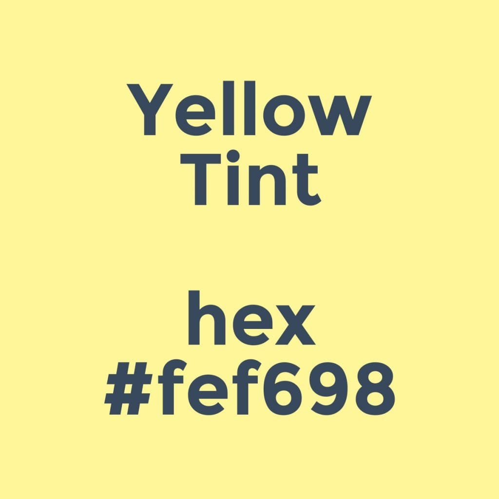
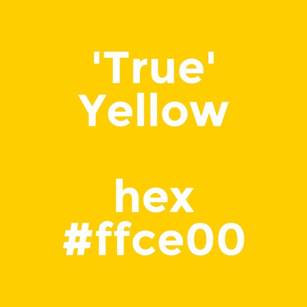
Yellow isn’t JUST ‘yellow’!
If the quiz says ‘yellow’ should be your branding color, you still need to choose if it should be vibrant, a tint, a shade, etc. based on your customer avatar.
Scroll back up to Step 3 and see how the two picture examples (energetic vs. tranquil) are both using a yellow palette, but project entirely different moods!
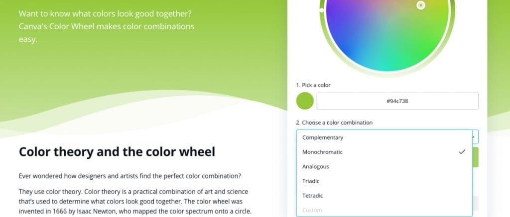
Go to the Canva Color Wheel and use your pointer to find the perfect hex #.
Your dominant color should be used in your branding 60% of the time, so make sure it sends the message your customer avatar will respond to!
Step 6: Choose Your Color Scheme
Based on your dominant color, decide if you want your palette to be monochromatic, analogous, complementary, or triadic.
The easiest tool I have found to quickly compare schemes is the same color wheel mentioned above.
Make sure your dominant color is selected on the top line, and then choose a color combination from the drop-down menu.
Decide which colors in your scheme will be your secondary and accent colors:
- Secondary colors should be used 30% of the time
- Accent colors should be used 10% of the time
Step 7: Choose Your Font Color
For skin care branding, your font color is what is printed on product labels, used for text on a website, and copy on social media graphics.
You could have the same font color for both web and printed materials, or a different one for each.
Websites:
If you decide to sell on a marketplace such as Etsy, you won’t have a choice on your website font color.
However, on website builders such as Shopify and WordPress, you do.
Labels:
Regardless of what online platform you use, you always have a choice in your own label design.
Whether you have a printer at home or will be having your labels professionally printed, you could easily have navy blue print on a yellow label (dark ink on light paper).
If you’re going the ‘professionally printed’ route, you are open to more options, such as a white or clear font on a darker background (light ink on dark paper).
Step 8: Choose Your CTA Button and Link Color
Your CTA (call-to-action) color could be used as a button or hyperlink on your website (the colored area that you click on for more information that says, ‘Buy Now’ or ‘Add to Cart’).
This color can also be used for ‘Sale!’ graphics in social media posts and as other minimal accent colors.
Warm CTA colors (red, orange, yellow) perform the best across the board.
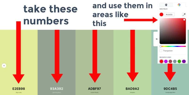
Step 9: Write Down All Hex Numbers and Uses
Always, always, always use hex numbers.
The official definition for a hex number is “a six-digit, three-byte hexadecimal number used in HTML, CSS, SVG, and other computing applications to represent colors.”
In other words, a hex number is an exact identifier for a color.
You can’t trust your naked eye or a color dropper to choose your color for you. When you find a color you like, WRITE THAT HEX NUMBER DOWN!
Picking a SPECIFIC (and intentional) hex # for each function of your business (labels, font pairings, website headers, CTAs, business cards, etc.) will save you SO much time as you design in the future – it will also make your brand incredibly recognizable and identifiable over time.
More Branding Tips for Your Skin Care Business
The color palette for your skin care business is just the tip of the branding iceberg.
To have high conversions and customers that return again and again, you want to be consistently branded in every product you sell, font you use, and email you send.
Whether you are just getting started on your entrepreneurial journey or are considering a rebrand, be sure to check out the skin care business branding section of this site for more tips!
Grow Your Skin Care Business!
Browse through the resources below to boost your handmade business visibility and profitability!