If you want to create a professional, trustworthy image with your handmade products, then choosing the fonts that work for your skin care business is crucial.
There are so many different font options available that it’s easy to lose track of what will work WELL for your brand and WHY.
This tip list will help you choose the perfect font combinations to give your skin care business an identifiable, branded look without being distracting or difficult to read – you’re sure to find visual inspiration that works well for all aspects of your marketing and brand identity!
This post may contain affiliate links, meaning I get a commission if you decide to make a purchase through my links (at no cost to you). Please read the disclosure for more information.
What is a Font?
So that we all start on the same page, a font is a set of printable or displayable text characters in a specific style and size:
This font is Montserrat.
This font is Pacifico.
When choosing a font for your skin care business branding, the ultimate goal is BRAND RECOGNITION across all platforms.
This means using the SAME fonts in the SAME way on your website, online marketing graphics, and skin care product labels so that your customers can easily identify you while quickly scrolling on their phones and desktops.
Choosing a font pairing (meaning two or more fonts that are used together) is a huge aspect of your skin care business branding, and your choices have to look good on a computer screen AND in person on your labels.
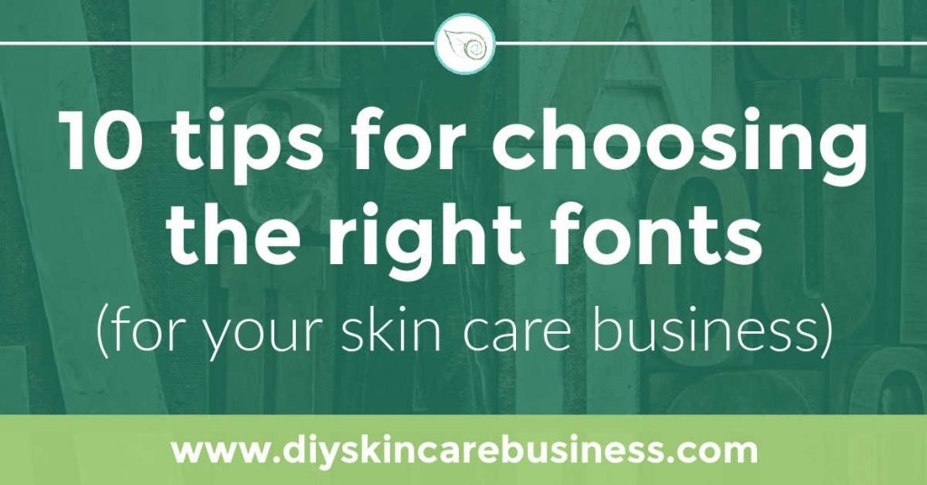
The ten tips below will help you to choose the best fonts for your skin care business to visually represent your brand identity.
Tip #1: Match Fonts to Your Skin Care Brand Strategy
The first step in choosing the right font for your skin care business is ensuring that you have a well-developed brand strategy.
You need to know who you’re selling to and what you want people to think of when they see or hear your business name; this should inform all of the visual decisions you make for your business.
- Do you want your business to be seen as young and fresh?
- Do you want your business to be seen as science-backed and an authority on skin care?
- Do you want your business to be seen as handmade and local?
Each of these bullet points would be visually represented in very different ways through font choices and your color palette.
If you’re not sure what your brand personality or audience is, take the time to discover your target market and develop a customer avatar.
Tip #2: Understand Font Categories
There are four main font groupings, and they all speak their own language:
- Serif
- Sans-serif
- Script
- Decorative
Many of the fonts in these categories have been around for hundreds of years, and they’ve developed specific personality traits over time as well as the ability to convey certain feelings and ideas.
Take a look at your target market. Is it younger? Laidback? Straight and narrow? Choose your main font style based on this.
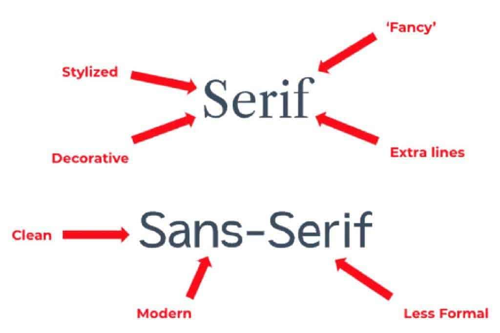
Font Category 1: Serif
Serif comes from the Latin root ‘finis,’ meaning ‘end.’ This refers to the serif’s origin in handwritten lettering, where it was used at the end of strokes to keep the letters from clumping together.
Serif fonts are great for highly detailed labels that need to be read at a distance or on printed materials like magazines or business cards.
They also tend to be a bit more serious, traditional, mature, and can communicate ‘expensive’.

Font Category 2: Sans-serif
Sans-serif fonts, on the other hand, do not have these serifs at the end of strokes and thus appear cleaner and more modern; they’re great for online use.
They tend to carry the feeling of being more progressive, neutral, less formal, and young.

Serif and Sans-serif fonts are the most common font categories you’ll come across when choosing a font for your skin care business.
Font Category 3: Script
Script fonts can be playful or serious depending on the style you choose.
They are intentionally designed to look like handwriting, so it’s important to make sure they are legible.
These are best used in a large font size – avoid all uppercase letters when using script, as that can become incredibly difficult to read.

Font Category 4: Decorative
Decorative fonts (aka, ‘display font’ depending on your graphic design program) are the most contrast-heavy of the four font categories, and they’re used for adding visual interest to packaging designs.
These are great for adding a unique, branded look to your products since they’re not very common. When done well, they can add a distinct personality to your skin care product labels.

Rocky Mountain Soap Market uses different decorative fonts depending on the product – each scent of their beard balm has the perfect corresponding label:
Tip #3: Use Legible Fonts
Size of font
The fonts you pick for your skin care business should be easy to read (especially in small print details).
Many ingredients on labels are at the minimum 6 px font size. Make sure your typeface can be read at such a small scale.
These four examples below are all size 6 px…which one is the easiest to make out?
This sentence is a 6 pt font.
This sentence is a 6 pt font size.
This sentence is a 6 pt font.
This sentence is a 6 pt font.
Clarity of font
Many makers use a script font on their labels; if not done well, it makes the product and information completely illegible.
It doesn’t really matter if something looks beautiful if it can’t be read, now does it?
A quick tip for script or decorative fonts (if you choose to use them), is to use them as large, one-word visual details only for visual appeal.
Sweet Hope Soap Co. uses script well, using it only for product name and section headers on her website so it’s legible and doubles as a prominent decorative element:

Tip #4: Use Contrasting Fonts
The basic idea of ‘font pairings’ is that using contrasting fonts together makes your text easier to read.
So instead of pairing two very similar fonts together (such as Helvetica and Roboto), try finding fonts that look good when paired together but have distinct contrast.
This creates a sense of interest and energy, which works well on skin care product labels.
Go ahead and experiment with both serif and sans-serif on the same label or marketing materials!
When done well, this can create an interesting balance that looks creative, intentional, and also helps to guide the eye.
Luminous Rose has mastered the art of using multiple font categories to communicate the experience and authority she has as a maker with a fresh, clean, luxurious brand identity:
Tip #5: Use Three or Fewer Fonts
Be cautious with font pairings, as too many fonts make it very difficult for the reader’s eye to know where to focus, appearing disorganized and amateur.
Keep to a minimum of 3 fonts (using 2 is even better).
Even if you choose to use only 2 fonts, the possibilities are still very wide.
Choosing a font that has a variety of weights (thin, medium, bold, extra bold, black) still gives you plenty of options.
Some companies even choose just ONE font and have fantastic labels and websites due to using many weights and a unique way of using capital and lowercase letters stylistically.
Juniper Apothecary has absolutely NAILED the art of using a single sans-serif font, resulting in a very modern, clean, minimalist look:
Tip #6: Learn About Visual Hierarchy
Typography can be used to organize information and how the eye travels along a label or website.
Take your skincare product name, for example.
If a business is called ‘The Skin Shop’ and a product is named ‘Nourishing Nighttime Serum’, then you can use the font size and weight to help guide the customer’s attention so they first notice ‘The Skin Shop’ font and then the product name after:
The Skin Shop
Nourishing Nighttime Serum
Or maybe you want it to be the opposite (you want them to see the product name first and your company name second). Simply bold and enlarge the product name instead:
The Skin Shop
Nourishing Nighttime Serum
Using visual hierarchy is an effective way to organize information so that you can literally guide your customer where to look first, all with the power of size, weight, and placement of fonts.
Hello Young Soapery does a great job of showing us where to look with the bold, script product name, slightly less bold business name, and smaller product details in an all-caps sans serif font:
Tip #7: Consider Google Font Pairings
There are many different websites for you to find and download fonts, but there are notable reasons that some businesses decide to keep things simple and stick with a Google Font.
The typefaces on Google Fonts are free for commercial use.
They can be used on your websites, product labels, and marketing materials, all without the need for a license. For zero dollars. Major points for that one.
Google Fonts are super fast to install and embed in websites.
On the off-chance you don’t already have them on your computer, you can download Google Fonts here.
Google Fonts improve loading speed.
Most online audiences are using Google already, which means that Google Fonts are already cached on their device…that means a website using these fonts will load faster than those that use atypical fonts (depending on other website design factors, of course).
The top graphic design and editing platforms have Google Fonts as built-in options.
This means there is no need to upload Google Fonts to the main tools we use as online businesses, such as Shopify, WordPress, PicMonkey, Canva, and Google Slides.
Some graphic designers say that the variety available in Google Fonts is limiting. They say they’re overused and maxed out.
Even if some of them are more recognizable than others, you can still do so much by mix and matching fonts together, changing them up with your color palette, and making them ‘yours’ with all kinds of various visual branding choices.
Tip #8: Know Your Budget and Licensing Requirements
If you decide you want a unique look, this is the world’s largest collection of fonts.
When choosing fonts for your skin care business, pause to consider what you can afford and have the rights to.
Not all fonts are free, and it’s important to know if you have lifetime use and any other stipulations with the purchase.
The last thing you want is a beautiful font that costs hundreds of dollars, only to find out that it’s not allowed for use on product labels.
Make sure you’re reading the small print (aka licensing options and agreements).
Tip #9: Play with Brand Font Generators
The easiest way to choose your font pairing is by actually seeing them together with your own eyes.
While you could always open up a Word or Google Doc and just start mix-and-matching from the font dropdown bar, I highly suggest starting with the following websites to get ideas flowing:
Done-for-you collections if you want to see pairs that already work well together:
Another resource if you want to play around and make font pairs on your own:
Tip #10: Research Other Skincare Brand Fonts
To make the most of your time researching the perfect fonts for your skin care business, it’s worth taking a close look at what other brands have successfully used for some inspiration.
If you come across a label you love, get instant font identification here (click on ‘the What The Font’ drop-down) just by uploading a picture (a simple screenshot is all you need).
This will show you the exact font used on the label (or website), as well as other suggestions with the same characteristics.
There’s even a mobile app for that same tool – be careful, it’s addicting!
When it comes to fonts, there are no hard and fast rules. The key is for you to find the right font that matches your brand personality.
Once you’ve found a few options that work well together, test them out on drafts of your product labels and online marketing materials BEFORE making your final decision.
This is the foundation of your visual brand identity – take the time to find the perfect fit!
Grow Your Skin Care Business!
Browse through the resources below to boost your handmade business visibility and profitability!